Colorful Boho Bedroom Ideas: Using Bold Color With Control
How to use saturated color in a boho bedroom without chaos: choose three colors, let one lead, repeat each three times and break them up with cream and wood.
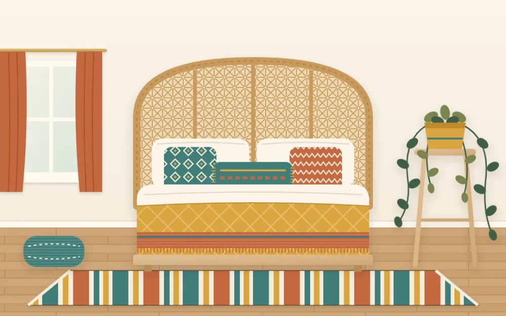
A colorful boho bedroom gets its charm from saturated color: terracotta beside teal, mustard against cream, a rug that pulls all of it together. The same ingredients can tip into noise quickly, and a bedroom is the one room where you want color to feel lively by day and settled at night.
The difference between those two outcomes is rarely the colors themselves. It is how many you use, how much of each, and where they sit. The ideas below give you a structure to work inside, so you can be bold without second-guessing every pillow.
Pick two or three colors and name a leader
Choose two or three saturated colors and stop there. Terracotta, teal and mustard is a classic trio, but deep green, rust and blush, or indigo, ochre and brick work the same way. Then decide which one leads. The leader takes the most colored surface, the second supports it, and the third appears only in small touches.
Naming a leader matters more than the colors you pick. Three bold colors in equal amounts compete with each other, and the eye has nowhere to land. One clear leader with two helpers reads as a decision.
If you are unsure which colors belong together, start from one thing you already own and love, such as a rug, a quilt or a print, and pull your trio from it. Colors that sit far apart on the color wheel, like terracotta and teal, give lively contrast. Neighbors, like terracotta and mustard, give harmony. One contrast plus one neighbor is an easy recipe.
Keep one big surface quiet
Bold color needs a calm background to show up against. Let either the walls or the base of the bed stay quiet, and ideally both. Cream, warm white, sand and oatmeal all do the job, and they are warmer partners for saturated color than a stark white.
- Quiet walls, colorful bed: the easiest version. Plain sheets and a plain duvet cover, then a quilt, pillows and a throw carry the color.
- Colored wall, quiet bed: if one wall is already a strong color, treat it as your leader and dress the bed mostly in cream with accents in the other two colors.
A palette built from warm, muted shades is a good base to put brighter color on top of. The guide to building an earth-tone bedroom palette covers how to choose that base.
Repeat each color in three places
A color used once looks like an accident. Used three times, in different parts of the room, it looks planned. For every color in your trio, find three spots, and spread them out so the eye travels across the room instead of stopping at the bed.
For a teal supporting color, that might be a pillow on the bed, a stripe in the rug and a glazed pot on the dresser. A slightly deeper or lighter teal is fine and adds depth.
Tip
Vary the size of the repeats: one large, one medium, one small. A quilt, a pillow and a small vase in the same color feel more relaxed than three objects of equal size.
Let one pattern tie the colors together
The fastest way to make three bold colors look related is a single textile that contains all of them. A striped rug, a patterned quilt or one large pillow in terracotta, teal and mustard works as a key for the room: every solid piece nearby now has a reason to be there.
Choose that piece first if you can, then pick solids that match the colors inside it. If you want more than one pattern, keep them in the same colors and change the scale. The guide to mixing patterns by scale explains how to do that without a clash.
Put the strongest color low or on the bed
Where a color sits changes how loud it feels. Strong color at floor level or on the bed feels grounded. The same color scattered at eye level on every wall and shelf feels busy, because you meet it wherever you look.
So give your leader to the quilt or the rug, and keep the upper half of the room lighter: pale walls, a natural woven piece, one print that picks up a color from below. A rug is often the best home for the boldest shade in the room. For sizes and placement, see the guide to choosing and placing a bedroom rug.
Break the color with wood and cream
Saturated colors need pauses between them. Natural wood, rattan, jute and cream textiles are those pauses in a boho room. A rattan headboard behind bright pillows, a wooden stool beside a mustard quilt or a cream throw folded over a patterned one gives the eye a place to rest before the next color.
As a loose guide, aim for more quiet surface than colored surface. If you squint at the room and see mostly cream and wood with clear patches of your three colors, the balance is about right.
Test the combination with textiles first
Textiles are the low-commitment way to try bold color, because they can be moved, swapped or stored. Before you paint anything or buy a large rug, run this test with things you already have.
- Clear the bed down to its plain base layer.
- Lay out candidates in your three colors: pillow covers, throws, scarves, a folded quilt, even clothing in the right shade.
- Arrange them in rough proportion, with the most of your leader and the least of your third color.
- Step back to the doorway and look, then look again in the evening under lamp light. Colors shift between daylight and warm bulbs.
- Leave the arrangement for a few days. If it still pleases you, build on it. If one color keeps bothering you, swap that one out and test again.
When the room feels too loud
If the bedroom looks restless after you have added color, the fix is usually removal, not more buying. Work through these in order and stop as soon as the room settles.
- Count the colors. If you find five or six, take out everything that is not in your trio.
- Find the leader. If no color clearly dominates, remove a few pieces in the other two.
- Clear the eye-level clutter. Move small bright objects off shelves and walls and keep the color on the bed and floor.
- Add a pause. Put a cream pillow or a plain throw between two patterned or bright pieces.
Frequently asked questions
How many colors should a colorful boho bedroom have?
Two or three saturated colors is a comfortable range for most bedrooms, on top of a quiet base of cream or warm white and natural wood. More than that tends to read as clutter. If you want variety, use lighter and deeper versions of your chosen colors instead of adding new ones.
Can I use bold colors in a small bedroom?
Yes. Keep the walls and the base of the bedding light, and concentrate the strong color on the bed and the rug so it sits low in the room. Fewer, larger blocks of color usually feel calmer in a small space than many small bright objects spread across every surface.
Which colors go well with terracotta in a boho bedroom?
Teal and deep blue-green give terracotta a lively contrast, while mustard, ochre and rust sit close to it and feel harmonious. Olive and forest green work as quieter partners. Cream, sand and natural wood go with all of these and give the brighter shades room to stand out.